Progress
A highly customisable progress bar with optional sections.
Properties
| Name | Type | Description |
|---|---|---|
| Width | Fusion.UsedAs<UDim>? | The width of the progress bar. (Defaults to UDim.new(1, 0)). |
| ProgressPercent | Fusion.UsedAs<number>? | The amount of progress that has been made (number between 0 and 1). (Defaults to 1). |
| Sections | Fusion.UsedAs<number? | { string }?>? | Optional sections for the progress bar. Use an array of strings if the sections have titles, otherwise use an integer. |
Example
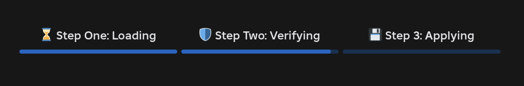
Scope:Progress {
  Width = UDim.new(1, 0),
  ProgressPercent = .65,
  Sections = { "⌛ Step One: Loading", "🛡️ Step Two: Verifying", "💾 Step 3: Applying" }
}