Container
A super customisable container that can have a header, and can be expanded and collapsed. (Height is automatically determined).
Properties
| Name | Type | Description |
|---|---|---|
| Width | Fusion.UsedAs | The width of the container. (Defaults to UDim.new(1, 0)). |
| Header | HeaderProps | The properties for the container's header (omit if you do not want one). |
Header Properties (HeaderProps)
| Name | Type | Description |
|---|---|---|
| Text | Fusion.UsedAs<string> | The Text (title) for the header. |
| IsExpanded | Fusion.UsedAs<boolean>? | If the container should be expanded. |
| Content | Fusion.UsedAs<Fusion.Child>? | The header content (aligned to the right). |
| Disabled | Fusion.UsedAs<boolean>? | If the header is to be disabled. Designed for toggling the header via a state object. |
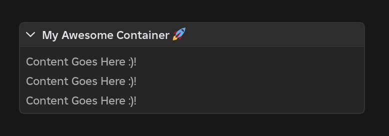
Example
Scope:Container {
  Header = { Text = "My Awesome Container 🚀" },
  [Children] = {
    Scope:TextLabel {
      Text = "Content Goes Here :)!\nContent Goes Here :)!\nContent Goes Here :)!",
      LineHeight = 1.4,
    },

    Scope:PaddingLarge()
  }
}