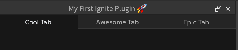
Tabs
Allows easy switching between different views.
Properties
| Name | Type | Description |
|---|---|---|
| Width | Fusion.UsedAs<UDim>? | The width of the accordion. (Defaults to UDim.new(1, 0)). |
| ActiveSection | Fusion.UsedAs<number>? | The index of the section in the Sections array to be active. (Defaults to DefaultActiveSection). |
| DefaultActiveSection | Fusion.UsedAs<number?>? | If no section is active then this section will automatically become active. |
| SectionSizing | Fusion.UsedAs<"Fit" | "Fill">? | The sizing mode for the tabs. |
| RightContent | Fusion.Child? | Optional content to display to the right of the component. |
Example
Scope:Tabs {
  Width = UDim.new(1, 0),
  Sections = {
    { Text = "Cool Tab" },
    { Text = "Awesome Tab" },
    { Text = "Epic Tab" }
  }
}