Text Input
An input for entering text.
Properties
| Name | Type | Description |
|---|---|---|
| Width | Fusion.UsedAs<UDim>? | The width of the text input. (Defaults to UDim.new(1, 0)). |
| Placeholder | Fusion.UsedAs<string?> | The placeholder for the text input. |
| Value | Fusion.UsedAs<string?> | The value of the text input. |
| Variant | Fusion.UsedAs<"Primary" | "Secondary" | nil>? | The variant for the text input. (Defaults to "Primary"). |
| Keybind | Fusion.UsedAs<{ Enum.KeyCode }>? | Specifies a keybind that can be used to focus the text input. |
| Validation | ValidationProps | string | nil | Specifies a pattern that the text input's data must conform to. |
Validation Properties (ValidationProps)
| Name | Type | Description |
|---|---|---|
| Pattern | Fusion.UsedAs<string> | The string pattern (opens in a new tab) that the text input's data must conform to. |
| Mode | Fusion.UsedAs<"Restrict" | "ErrorVisual" | nil> | Restrict prevents data that does not match the pattern from being inside of the text input whilst ErrorVisual shows a red outline around the text input when its data does not conform to the pattern. |
Example
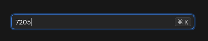
Scope:TextInput {
  Value = "7205",
  Keybind = { Enum.KeyCode.LeftControl, Enum.KeyCode.K },
  Validation = { Pattern = "%d+", Mode = "Restrict" :: "Restrict" },
}